
When clients or projects need design work, I rely on people at my agency or refer clients to designers I trust. Sometimes, though, a client doesn’t have the budget or time for a lengthy design process, and is relying on me to put something together.
To help that process along, I built a branding generator that puts together font and color combinations for a client to browse and randomly generate.
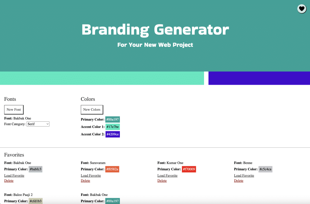
The fonts come from the Google Fonts API, and the colors from the Huemint API. The user can randomly generate a new combination by clicking the header, generate just a new font or just new colors, choose the style of font to generate, and save their favorites (using local browser storage, no database needed). You can also share the font and color combination by copying the URL and sending it to someone.
I needed a way to decide whether the font color for the text that is displayed over the randomly generated background color should be black or white, so that users can read it easily.
Researching and coding with assistance from Google’s Gemini, we get this JS function:
function getContrastColor(hexColor) {
	// 1. Remove '#' if present and expand 3-digit hex to 6-digit
	let hex = hexColor.replace('#', '');
	if (hex.length === 3) {
	hex = hex.split('').map(char => char + char).join('');
	}

	// 2. Convert hex to RGB values
	const r = parseInt(hex.substring(0, 2), 16);
	const g = parseInt(hex.substring(2, 4), 16);
	const b = parseInt(hex.substring(4, 6), 16);

	// 3. Calculate relative luminance (using sRGB weights)
	// Formula: L = 0.2126 * R + 0.7152 * G + 0.0722 * B
	const luminance = (0.2126 * r + 0.7152 * g + 0.0722 * b) / 255;

	// 4. Return black for light backgrounds, white for dark backgrounds
	// A threshold of ~0.5
	return luminance > 0.5 ? '#000000' : '#ffffff';
}
The Huemint API is returning colors as hex codes–the first step is to convert those hex codes into red, green, and blue values from 0 to 255 (255 being the brightest/most saturated).
Then we calculate “relative luminance,” which is how bright or dark the human eye perceives the color to be. People see greens as the brightest, reds as less bright, and blues as the least bright.
// 3. Calculate relative luminance (using sRGB weights)
// Formula: L = 0.2126 * R + 0.7152 * G + 0.0722 * B
const luminance = (0.2126 * r + 0.7152 * g + 0.0722 * b) / 255;
Finally, we get a number between 0 and 1. If the luminance is greater than 0.5, then the color is perceived as bright, and black text works best. If the luminance is less than 0.5, then the color is perceived as dark, and white text will be the clearest to read.
Featured photo by engin akyurt on Unsplash
